Case Study
Ghost Town To Town Square
Don’t throw away the history. Give it a new look.
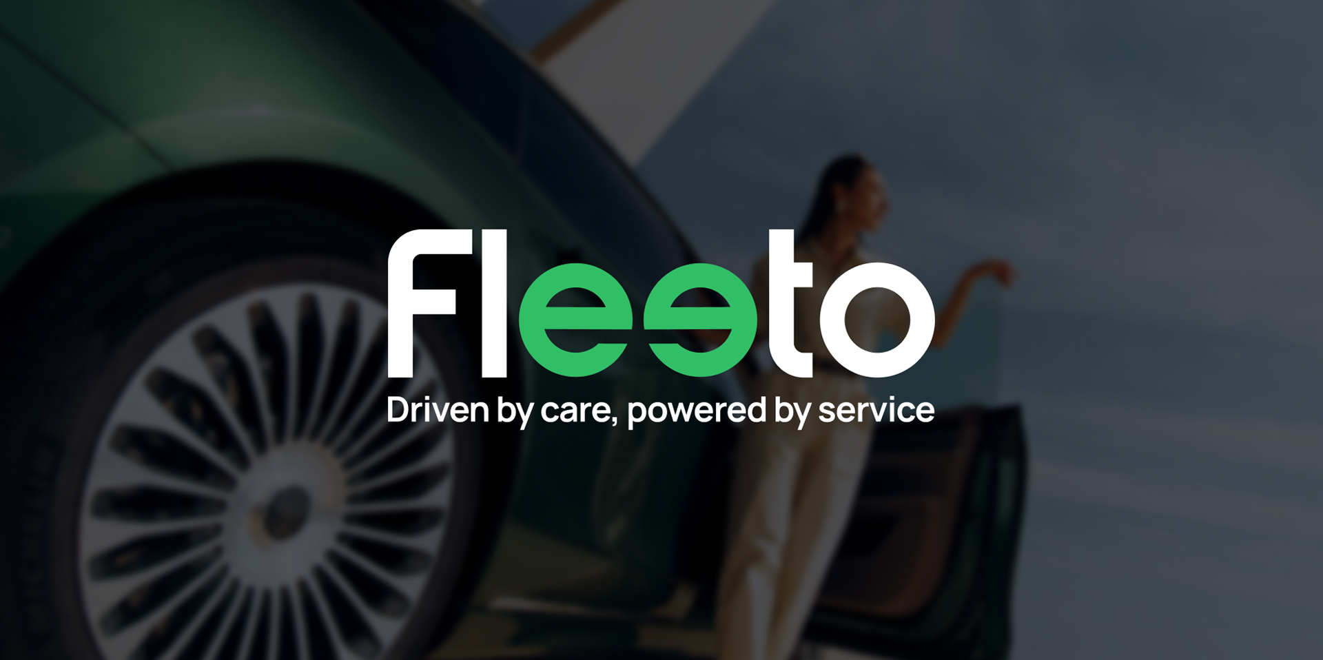
Simple Self Drive had years of experience behind it. Its identity no longer reflected the business it had become, making it harder to scale and move into its next chapter. So we gave it a new name, a new brand identity and a new direction.
Simple Self Drive became Fleeto. The business kept its experience and reputation, while the brand got a fresh identity built for the PCO market and the drivers it serves.
The result was a visual transformation that gave an established business a fresh face without losing its roots.
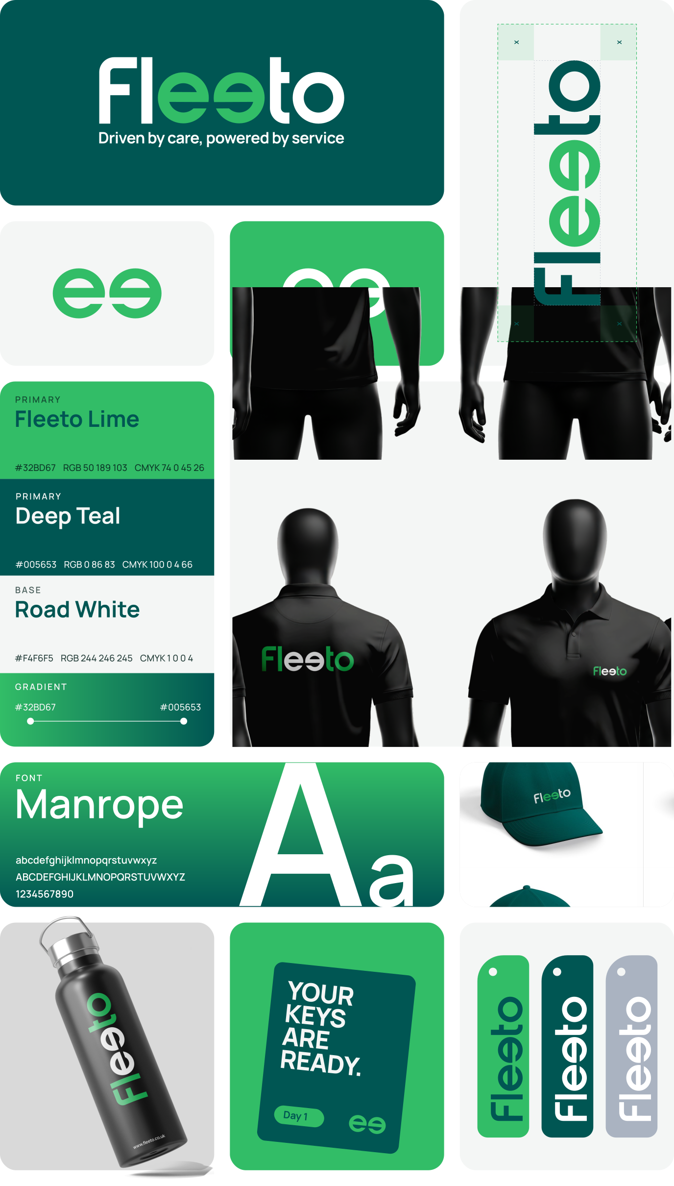
A Rebrand That Goes Beyond The Logo
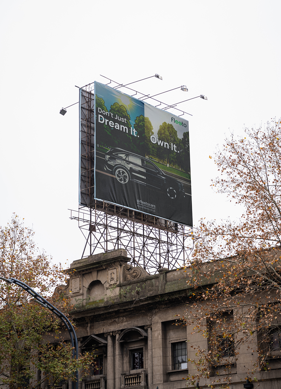
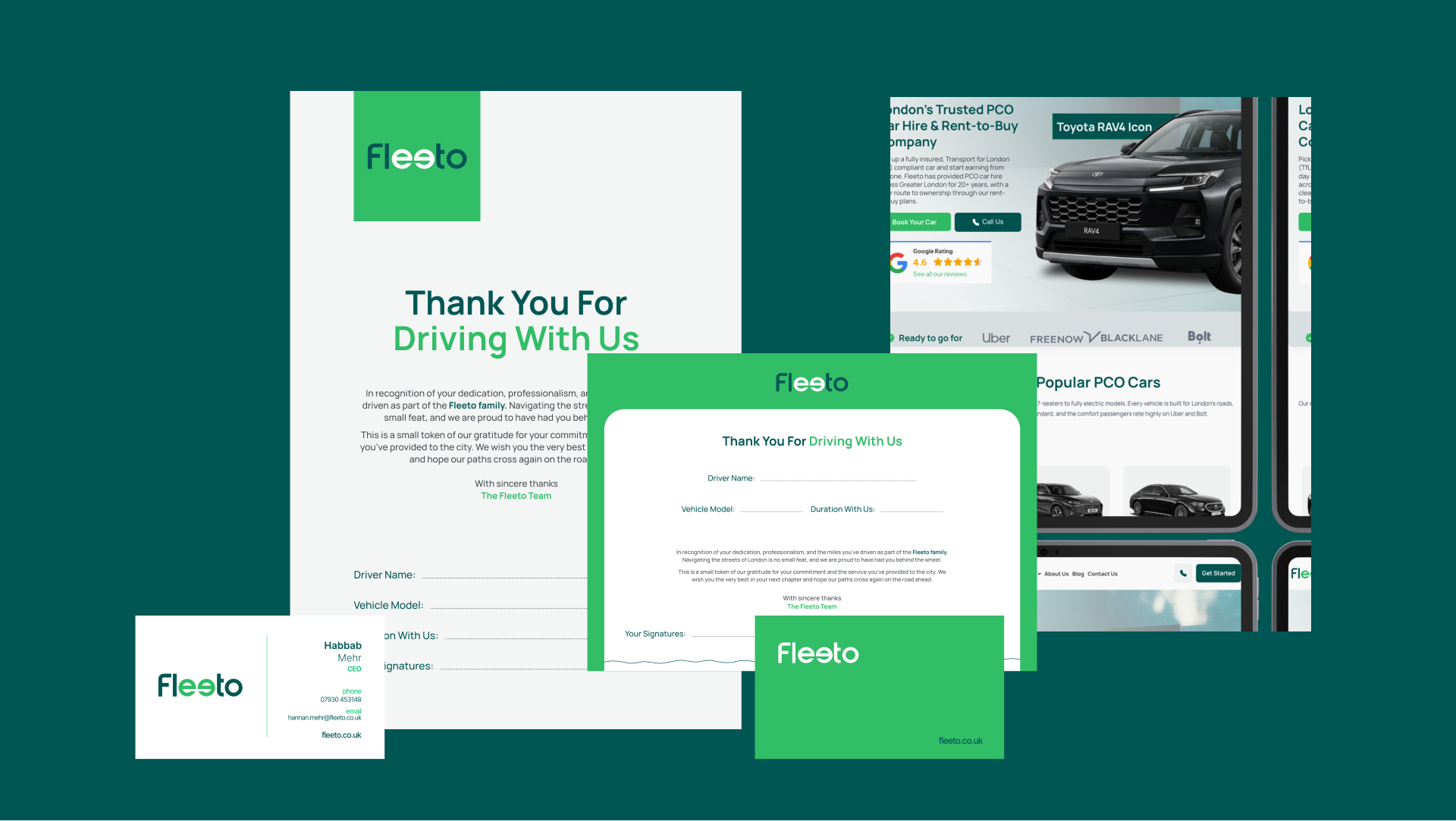
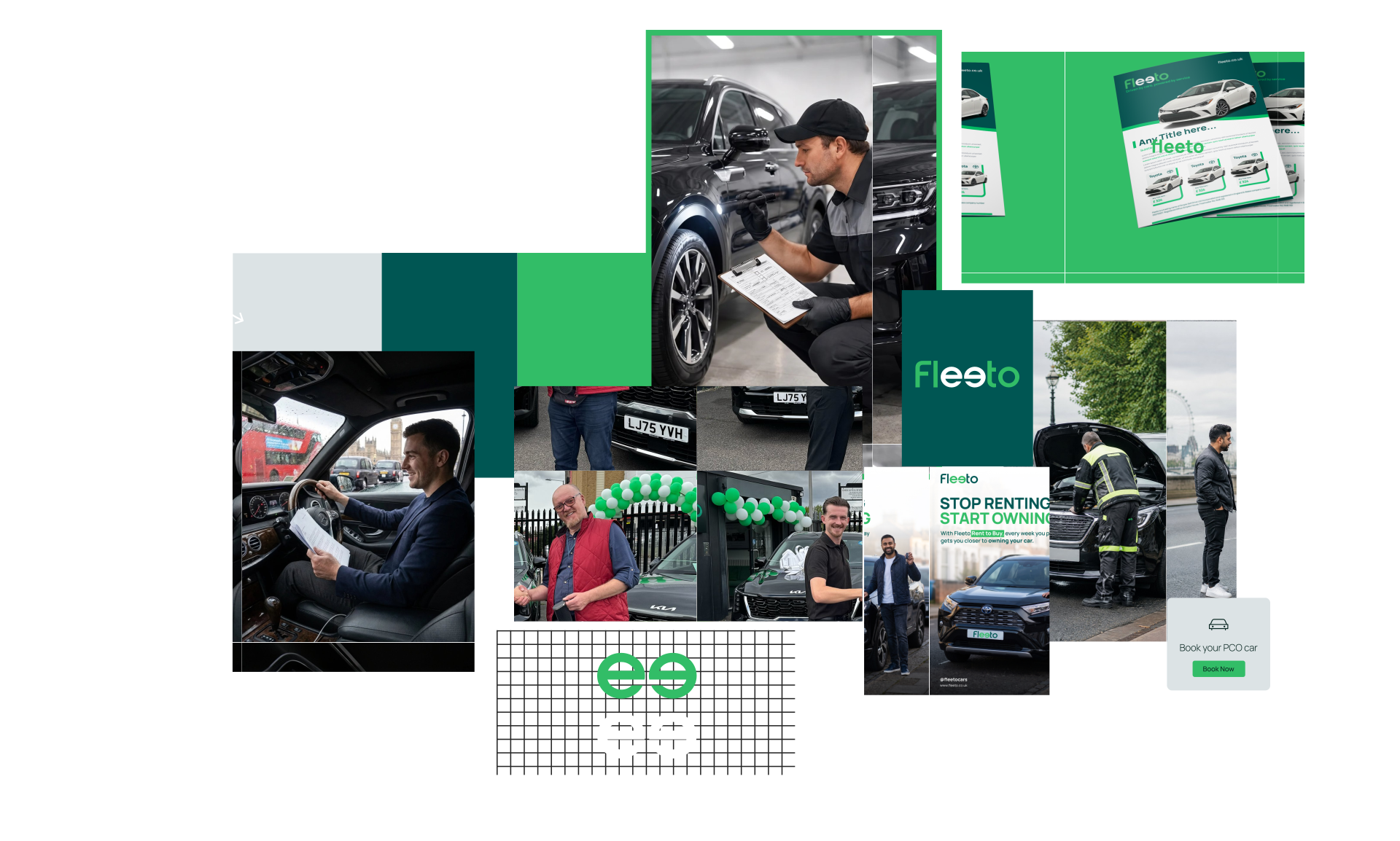
We brought Fleeto’s new brand identity to life through a redesigned logo, a fresh colour scheme and a complete visual rollout.
Visit the office, collect a car or open an email, and it’s unmistakably Fleeto.
The result was a recognisable look that strengthened its presence in the market and gave the business a bold foundation for growth.
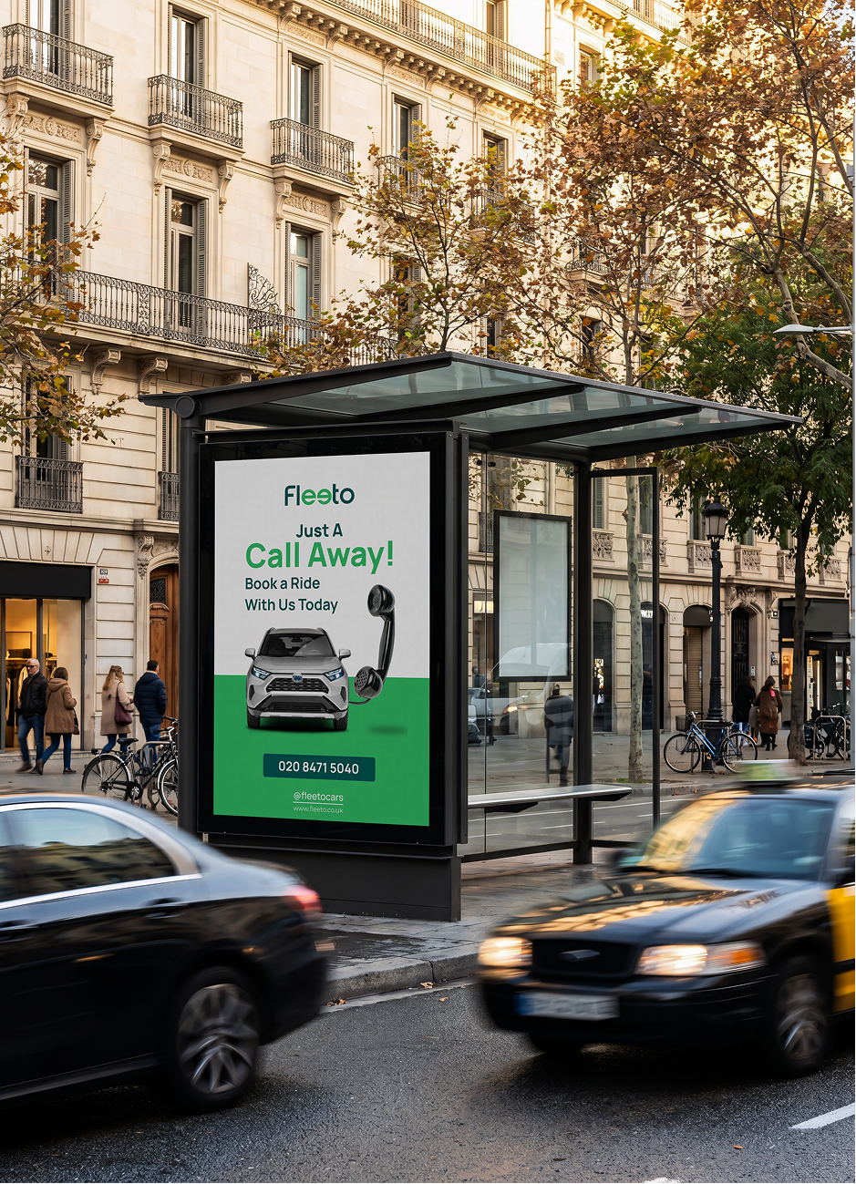
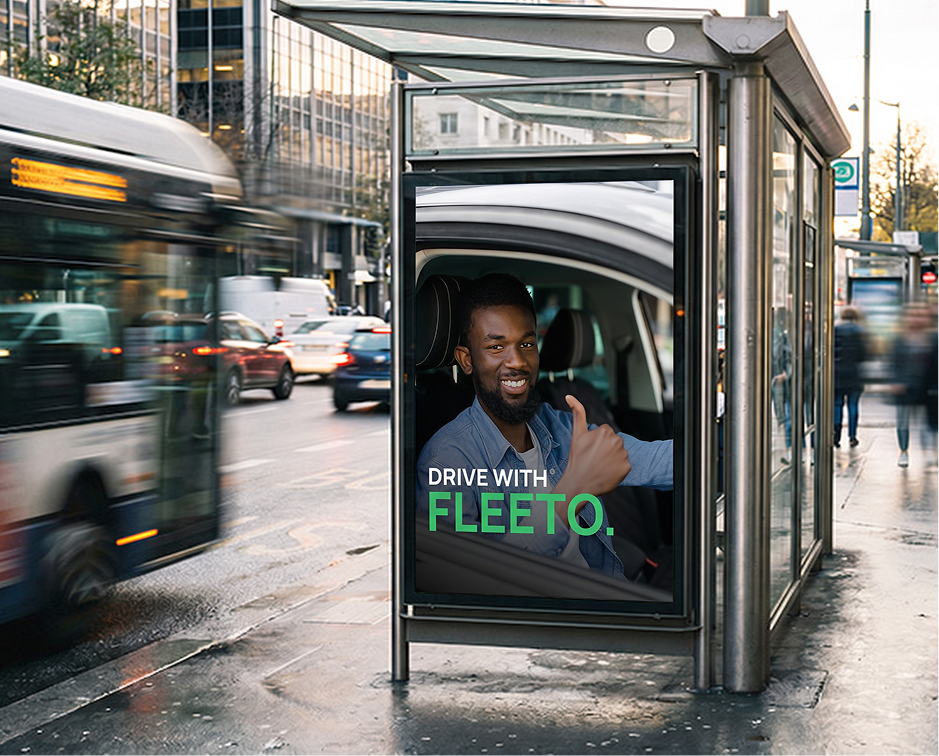
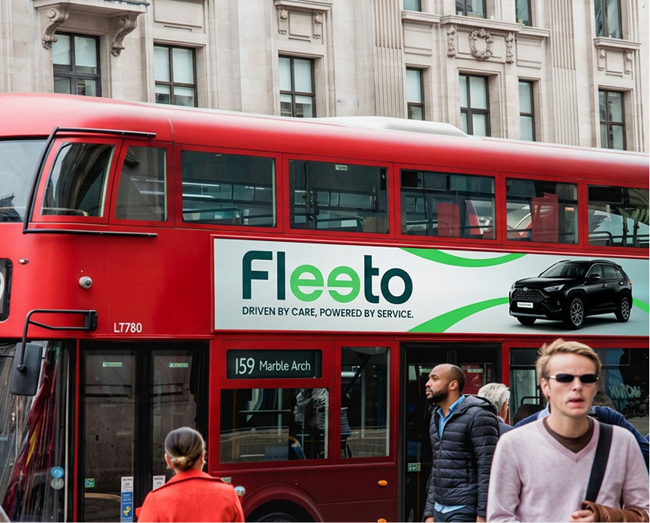
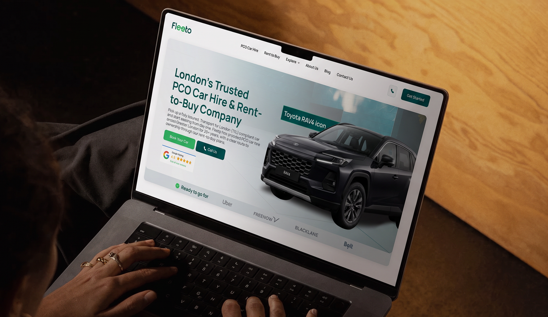
The biggest difference was they actually understood what our customers needed to see, not just what we wanted to sell. The new site feels like us.
From what they were known for to what they could become. Simple Self Drive had the history. Now, it was time for a new look, a new name and a brand ready to make its own mark as Fleeto.
Momentum Shows Up From Parked to Moving
The business wasn’t suddenly working harder. It just stopped working against itself.
You ask HOW?
Customers just weren't seeing the full picture. We gave Fleeto a complete brand makeover, with a new logo, visual identity and brand guidelines. These made it more recognisable to the communities it was built to serve and gave people a reason to trust.
The result was simple: Fleeto started showing up exactly where its customers were already looking, with a stronger foundation for brand awareness and visibility.
Before working with Ryetec, our website was basically just there. It looked fine, but it wasn't really helping us. The biggest difference was they actually understood what our customers needed to see, not just what we wanted to say. The new site feels like us, but it finally works like a proper sales tool.