Case Study
When Boring Meets Character
Claims Industry Stayed Serious.
The Brand Didn't Have To
In the claims industry, you don't get to choose when customers need you. An accident happens, and they reach for the first name they trust.
The problem? Most claims brands look and sound alike. Faceless, forgettable, and easy to mix up.
Simple Claims needed a brand identity that stuck before the accident, not just after it.
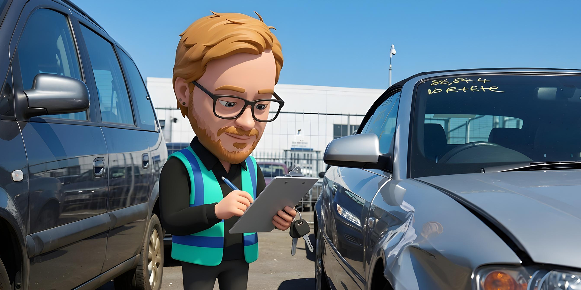
We refreshed the visual identity to create a consistent look across every touchpoint and introduced a mascot to put a face to the name. A little personality made the brand more recognisable, approachable and memorable.
Because when customers need to make a claim, being known beats being just another name.
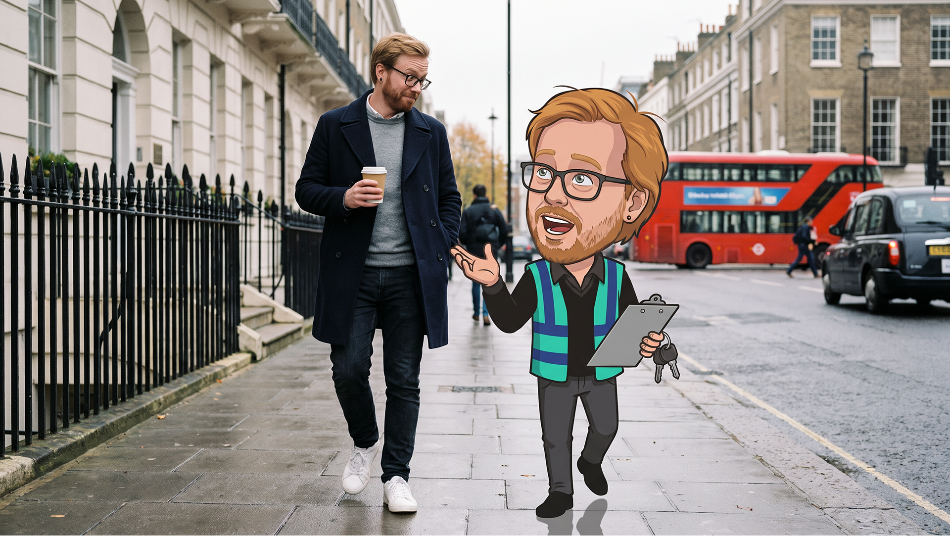
A friendly mascot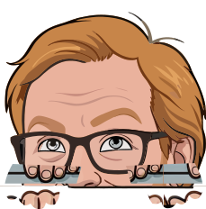 makes claims feel less like a crisis and more like calling a friend.
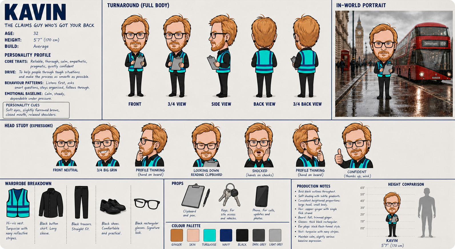
The Execution:
From Mascot to Movement
The mascot became the centrepiece of the new Simple Claims identity, but it was only the start.
We carried the same colours, tone, and visual style across the website, business profiles, leaflets, brochures, and every other customer touchpoint, backed by a brand guide to keep it consistent wherever the brand appears.
Wherever someone comes across Simple Claims, it looks and feels like the same brand. Instead of blending in with every other claims company, Simple Claims now feels familiar the moment someone needs it.
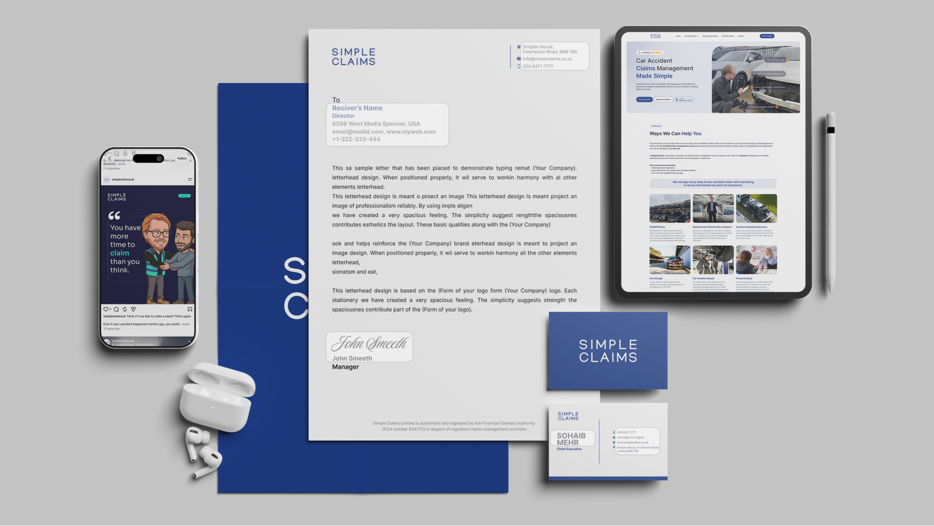
Less Grey. More Hey!
Ryetec broke industry conventions with bold creative, character-led branding and a fresh visual language across digital and print.

We transformed a faceless claims brand into a recognisable one. In an industry where customers only engage in crises, that's not decoration; it's strategy.
Creative HQ